Some individuals who hang up their shingle as home stagers think that home staging is simply about filling a home with stuff. Sometimes its even nice stuff (not always – we know of some stagers who use primarily “flea market finds”. Seriously!).
However, as many of our home staging clients throughout Winnipeg have come to learn, there is a lot of thought and strategy – and an intimate understanding of psychology, merchandising and interior decorating – that goes into all of the design decisions in effectively staging a house. Many people don’t realize that home staging, when done correctly, is not at all the same thing as “decorating”. It goes so much further beyond that. If you hired us to decorate the home you live in, it would almost always be approached differently – and turn out very differently – than if you hire us to stage a home for sale. In staging, we approach it from a merchandising and marketing standpoint. Whereas in decorating your personal home, we approach it from a livability perspective.
We recently had a discussion about this with one of our home staging clients – an investor who hired us to stage a condo in the south end of Winnipeg. He’d done a truly exceptional job with his design choices in renovating this property, and he had certain ideas about how he envisioned the property being staged which he discussed with us before he engaged us.
While his ideas would have been unquestionably fine choices if he was furnishing and accessorizing the condo as a personal residence, we walked him through our Home Staging vision for his property, explaining how home staging needs to be approached from a completely different perspective than if we are decorating a client’s home to live in.
After leading our client through just a few of the considerations that go into many of the design decisions we make as effective home stagers, the client sent us an email saying:
“Thank-You for the tutorial on staging – obviously NOT my strong point LOL. It all make sense and looks great as well. I can see that you guys are the pros!!! I feel a lot better now knowing I’m in your (capable) hands. Thanks again for all your help and especially your patience with me”.
What follows gives you an idea of just a couple the types of home staging considerations we make when deciding how to present a home for selling. The photos here are of some of staging work which we showed the client as part of walking him through the consideration process – they are not photos from this particular client’s home.
Back Wall of Dining Room:
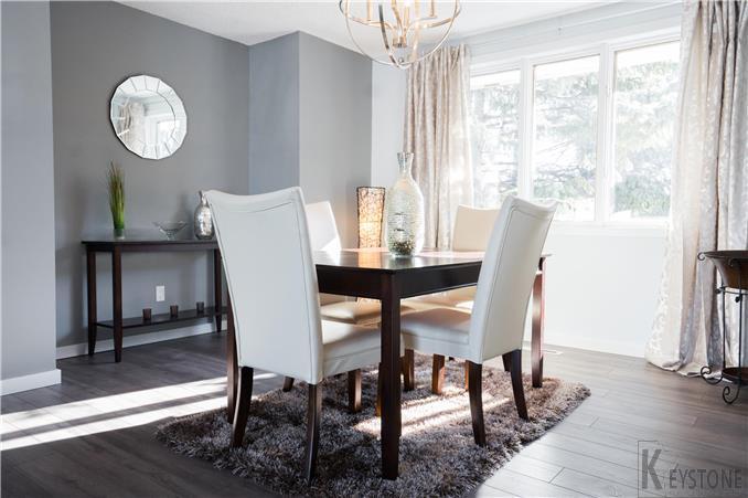
The color scheme in this client’s condo was very similar to that in the photo we showed him (which you can see below, and also at the top of this page), so it helped gives a very good idea of how all the individual pieces we were proposing to use in staging his home would come together.
The client had visualized a very large, rectangular gilded silver framed mirror on the back wall of his dining room.
My thought was to use the same style of mirror you see in this photo on the dining room wall; this style of decorative round mirror is right on trend right now in terms of styling, and has a very sparkly effect when you see it in person due to beveled detailing, so it looks quite stunning. The rectangular mirror our client suggested is a classic, timeless look, which is fine. However, for effective home staging, we like to incorporate pieces that reflect current style trends. This has the effect of creating the perceived impression in the buyer’s mind that the home is modern and contemporary – even it is actually on the older side. Accessorizing the home in keeping with current decor trends transfers the impression to the home itself.
 Dining Table: The client indicated that he had envisioned a large all glass table, with transparent glass legs for staging the dining room. Our vision for the space was to use the identical style of table and the identical chairs you see in this photo. The darker wood tone of the table will create a nice contrast against the wall color in the space, and the off-white leather chairs play off the wood nicely. This works very well in listing photos. When we stage, we need to consider choices from 2 perspectives: how the elements will look in the listing photos, in addition to how they look when viewed in person. Part of the value staging offers is to ensure that your property will really “pop” in photos, as that will attract larger numbers of showings. Often times a glass table will not pack as much visual punch in photos as what you will get with something that has more visual strength, like the table I’ve shown here. Glass tables tend to be a bit of a wash-out in photos.
If I was going to use a glass table, my recommendation would be something very similar or identical to what you see in the photo below, and I’ll explain why in a moment:
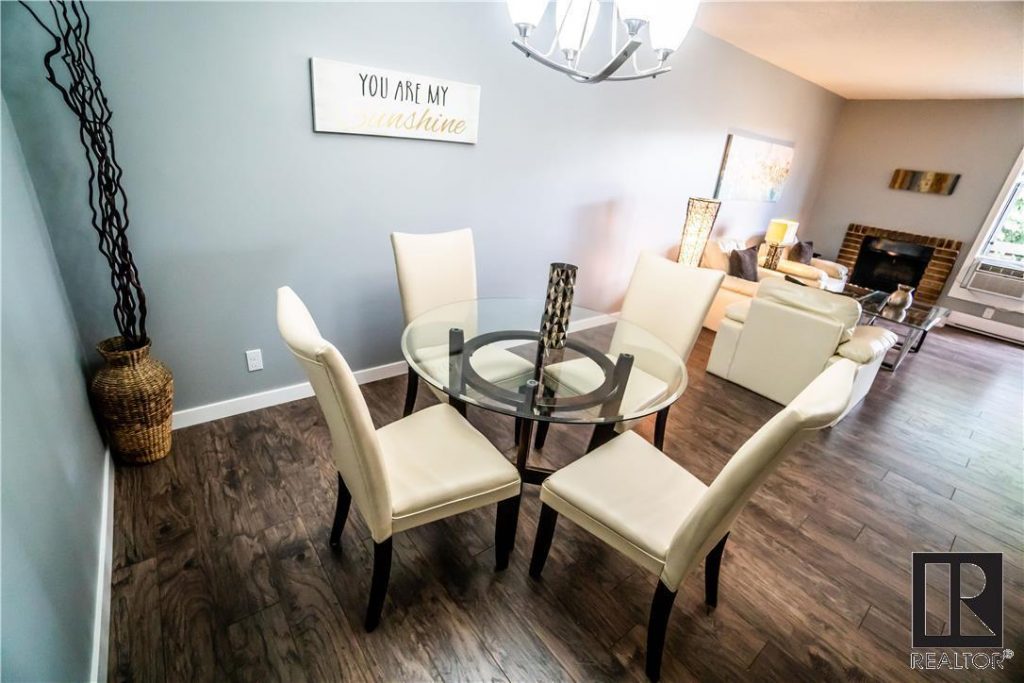
This glass top table is a good choice for a small space as in the client’s dining area (glass can make a space seem larger), yet it still shows very well in photos because of the nicely styled wood base which gives it more visual weight in photos and prevents the table from being a wash-out or disappearing in pictures. The base also coordinates very nicely with the legs on the dining chairs for a perfectly cohesive look.
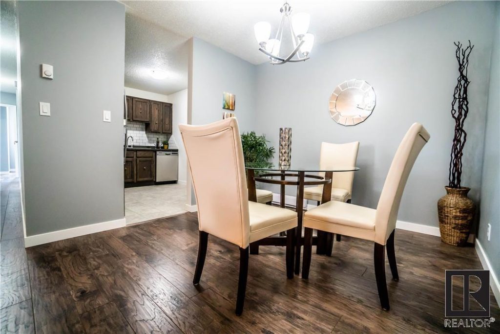
Ultimately, we intended to allow the exact table we’d use to be dictated by how exactly how the space would be coming together as we start staging – staging can be an iterative process whereby sometimes we finalize certain decisions “on the fly” as the whole picture is coming together. We usual travel to the homes we stage with a bit of rolling warehouse, always carrying extra pieces over and above what we’ve already planned out for the decision, just in case we want to swap around pieces once on site. We usually have a very accurate idea of exactly what we will use and what we will put where from the moment we set foot in the client’s site when we arrive to do a quote. But because this home staging is still a creative process (apart from being very strategic), we like to have the option of being able to “play” with different elements. It comes from a tendency for perfectionism! We don’t stop until we know the look is just right.
Staging the Living Room
White Furniture to Make Space Seem Larger:
When, we met with the client, he suggested using very bold colors for the furniture to create drama. However, this was a pretty compact space. My preference was to use white furniture (when I say white, I’m really referring to off-white, to be accurate, as pure white tends to lack warmth and feel stark) in the living room. White furniture is color-neutral, yet contemporary and elegant, and can look very sophisticated. So it would work very well in this space.
White furniture tends to make a room appear larger, whereas darker pieces give off the sense of occupying more space.
Because the living room is compact, we want to maximize the sense of space in every way possible, and white furniture will help to accomplish this. We inject color, contrast and visual interest into the space with the use art on the walls, toss cushions on the furniture and other accessories. For this condo, I was thinking silver crushed velvet toss cushions which will look elegant and contrast nicely on the white furniture, inject a very comfortable and welcoming feel through the soft and luxurious texture of the crushed velvet, and the silver color will also pick be very compatible with the grey tones on the walls and flooring, as well as coordinate very nicely with the other silver accent pieces and accessories we use to really bring the space to life.
One of the benefits of staging is that it can actually help to make a small space seem larger than it may look when empty (I know this seems counter-intuitive, but it works because in an empty room, a buyer has a tendency to think of the space as even smaller than it really is); through strategic choices in furnishings, we can now take that small space and make it seem larger.
Its important to ensure that we have some open space around the furniture, otherwise the staging will work against itself and start making the room seem cramped, crowded and therefore smaller. So for this reason I would use a white loveseat and pair it with an appropriately sized white armchair or two; then we add additional items once we start working with the space such as: accent tables, an accent chair, cocktail table, floor lamps and other style accessories. In the end the room looks fully furnished, inviting, comfortable, luxurious – yet at the same time spacious.
I don’t have a photo that shows the configuration using all of the actual pieces I had in mind, but offered this client a few individual photos from some of our client’s homes to help him visualize how well an off-white loveseat instead of a sofa works to create more of a sense of spaciousness, while still feeling perfectly in scale with the room (even in a space considerably larger than what this client had in his living room – the loveseat in no way looked dwarfed in the space):
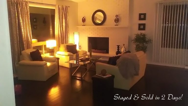
The living room in this 2000 sq ft house was actually considerably larger than the living room in the condo we were staging, and as you can see once we’ve got the loveseat, cocktail table and other elements in place it looks well furnished, and a sofa would have made it start feeling crowded and cramped.
A picture of the actual loveseat we had in mind for staging this property is below.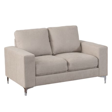
Above: Very current in styling while still maintaining classic lines, this piece offers an aesthetic which will appeal to the broadest range of people. The wide armrests and chrome legs deliver a soft modern aesthetic with a hint of glamour. Wide padded arms, give this piece a sizable appearance which will be perfectly proportioned to the size of the room to maintain a sense of scale and spaciousness, without risking the space feeling overstuffed or crowded. Upholstered in an off-white soft touch chenille, this soft texture once again subtly conveys a sense of comfort and at the same time luxuriousness, creating a comfortable, inviting environment. Picture this with attractive toss cushions for color and visual interest.
A Few More Photos of a Loveseat/ Chair combination in off-white…
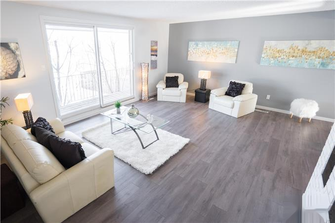
The photo above also demonstrates the staging advantage of using a loveseat rather than a sofa to play up the sense of space . Even though the space in the home in the photo was considerably larger than the condo in question, this client really liked the idea of using a loveseat as opposed to a sofa in order to maximize the feeling of spaciousness. And as you can see from the photos, even in a large area, assuming all the other elements are done correctly, a love seat works very well without appearing out of scale though it is smaller than a sofa.
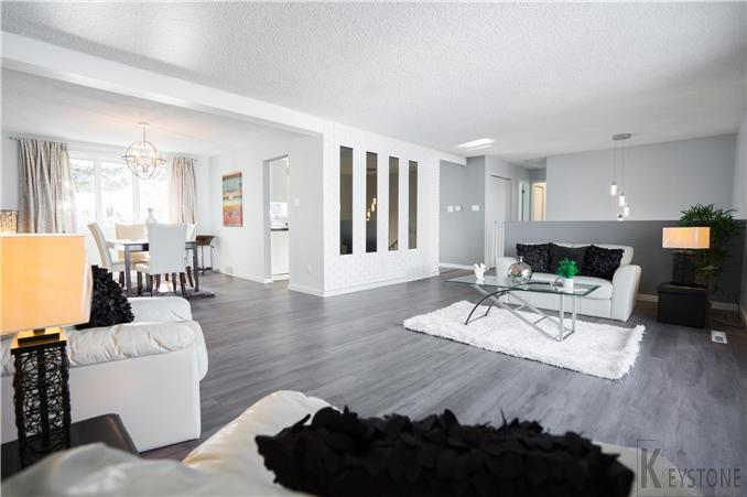
This photo above gives a wide-angled view of the full configuration of the space including the dining room included in the shot.
These are just a couple of examples of the behind the scenes considerations that go into every home staging project to give you a sense of what is involved, and the knowledge and expertise that it takes to stage a home effectively.
If you are a home owner, realtor or investor in Winnipeg with a vacant (or occupied) home to sell, give us a call for a no obligation quote on home staging for your property!
